Design System: ACM
Developing an Org-wide Design System

Timeline
10 weeks
Tools/Skills
Figma, Storybook, UX Research, UX Principles
Role
UI/UX Designer, UX researcher
My Scope
Internal user research, external design system research, figma component library creation
Problem
ACM's existing design system lacked scalability, preventing consistent use across web launches. This ultimately weakened ACM's brand identity and hindered project workflow.
Solution
ACM's development team developed a token-based, scalable system for streamlined workflow and long term sustainability.
Initial Research & Problem Discovery
Context: Membership Portal Redesign Concerns
The ACM Development team was tasked with redesigning our membership portal. We were on a tight deadline, and having to create a new style guide & component library for the project was taking too long.

Membership portal style guide in development
ACM had been creating a new style guide and component library for every website launch and redesign.
As a new designer on the team, it was clear to me that this current process wasn't sustainable.
Discovering our Design System (and why it wasn't being used)
Turns out, we did have a design system.

Current ACM design system
However, it was flawed in many ways that was preventing designers from being able to rely on it for new projects.
Current Design System Flaws
Outdated
The design system wasn't updated for new use cases since the beginning of ACM’s founding, back in 2020
Not scalable
Its lack of scalability inhibited org-wide usage, causing website-to-website design inconsistencies
Poorly documented
Vague descriptions without proper examples or concrete values.
Our Goal & Role
Goal Alignment
Our entire development team came together set clear “why”s for creating a design system and align our intentions. This project was great in scale and impact, so this step was vital.
4 Main Goals
Save time by streamlining workflow
Gain credibility by understanding industry trends and best practices
Aid the onboarding of future designers and developers
Improve cohesion to assure recognizability

Figjam post it note brainstorm of goals
How Might We...
Redesign & document a scalable design system that ensures long-term consistency & brand cohesion while streamlining workflow?
My Role
I collaborated with UX designers and developers to establish a scalable design system by utilizing atomic design principles, storybook for detailed documentation of each component, and creating a Figma component library.
User Research
CHALLENGE
How do we account for ACM's large and diverse demographic?
Biggest organization at UCSD
90+ board members spread across 9 teams
2000+ members and 150+ annual events
SOLUTION
Define main user groups to understand diverse perspectives
1
ACM board member
2
Finance team member
3
UX designer
4
Front end developer
5
General ACM member
In order to make sure that our design system met the needs of both our general members and board members, we split up the organization into 5 representative user groups. I researched the front end developer group.
SOLUTION
Create user journey maps & personas to identify needs and pain points


Front end developer journey map from design handoff to launch
RESEARCH KEY FINDING
Designers and Developers both need clear guidelines and documentation
CHALLENGE
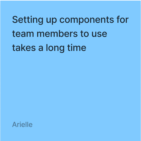
Designers struggle need clear guidelines for design efficiency and unity


CHALLENGE
Developers struggled with translating components from Figma





devs reported feeling stressed during handoff process because of…


SOLUTION
Implement Storybook to store component codes
Storybook: "A frontend workshop for building UI components and pages in isolation…used for UI development, testing, and documentation" (Storybook)

Storybook workflow visualization
In order to satisfy both the designers' needs of clear guidelines and developers' pain points over ambiguous design specifications, we found a joint solution to document our component library into Storybook.
With Storybook, we were able to save the code for commonly used components to streamline the development process significantly.
Building the Design System
Design Process
After our decision to utilize Storybook, we had 2 main deliverables: Storybook documentation and a Figma Design System.
To build our design system, we took 4 major steps:
1
ACM websites audit
2
Competitive Analysis
3
Create component library
4
Create Token Based Design System
WEBSITE AUDIT CHALLENGE
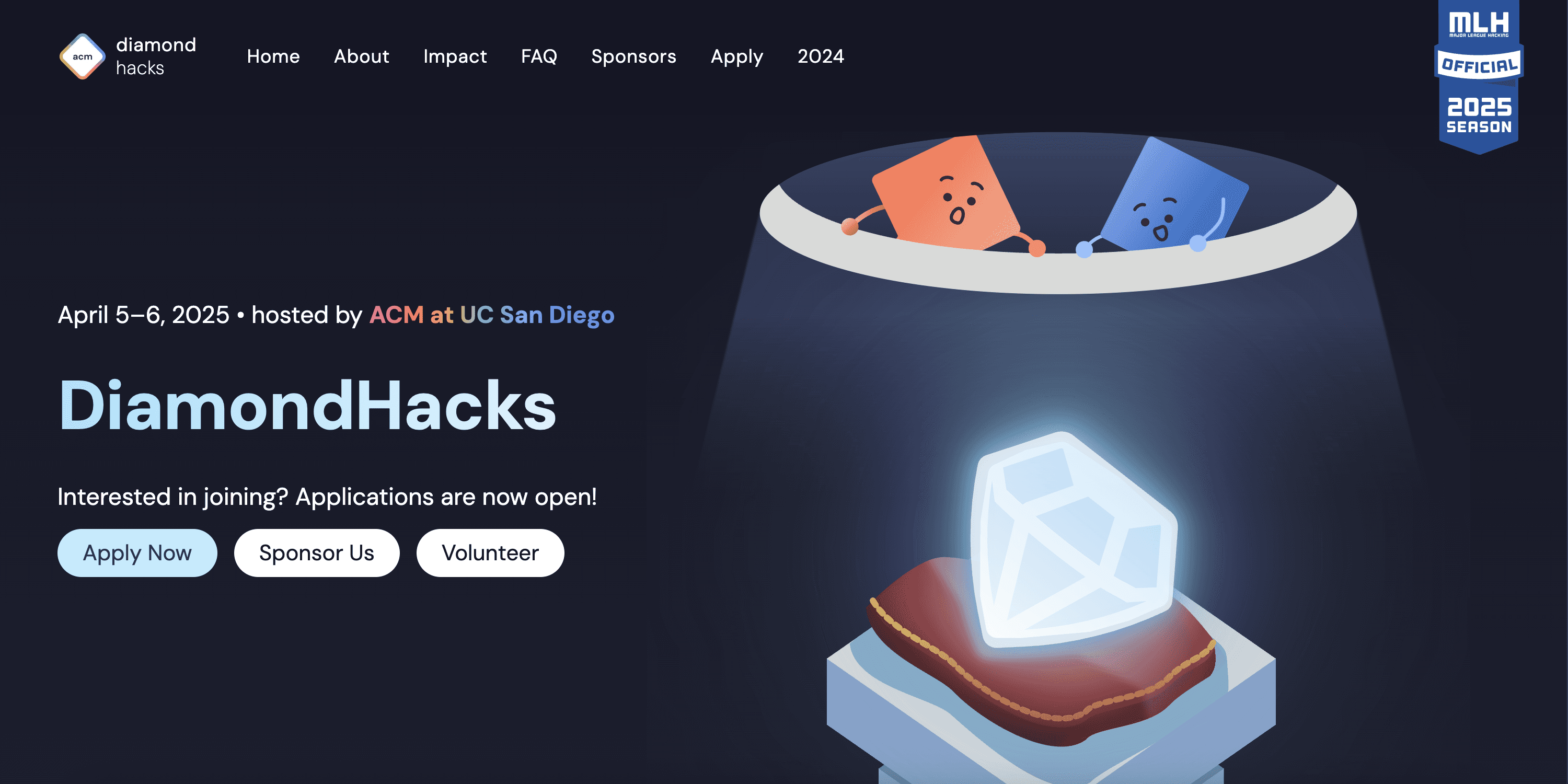
ACM had too many websites to audit
As an organization that had websites for every sector and major event, it quickly dawned on me that trying to audit every single one would put us way past our intended deadline. This meant our future projects would either get pushed back, or the team would be swarmed with work.


SOLUTION
Choose one representative to audit = Membership Portal
We decided to choose the Membership Portal to audit and base our design system and component library off of our findings.
Membership portal home page
Why the Membership Portal?
Most comprehensive & component-rich interface
Website that members interact with the most

Member participation leaderboard

ACM merch info page

Event information pop up
AUDIT STEPS
1. Record all components used in the website
First, we went through every page of our website to develop list of components we should include in our component library. I worked on the leaderboard page and assisted with the other pages.


AUDIT STEPS
2. Record use cases and inconsistencies for each component type
After capturing every component, we grouped similar components together to understand how they were actually being used across pages.

CTA Button use cases and inconsistencies
This helped us identify patterns, edge cases, and inconsistencies that needed to be addressed.
COMPETITIVE ANALYSIS STEPS
1. Study COMPONENT UI of established websites
Once we identified which components needed refinement, we reviewed how established websites designed similar components.

Study of Carousel UI
This helped us understand common patterns, interaction behaviors, and visual conventions that could guide our redesign
COMPETITIVE ANALYSIS STEPS
2. Study DESIGN SYSTEMS of established companies
After analyzing the UI of various websites, we then looked at established design systems to understand best practices for component creation and documentation to ensure scalability, accessibility, and seamless handoff.

e.g. 1: IBM’s carbon design system dropdown

e.g. 2: Microsoft Storybook buttons
COMPETITIVE ANALYSIS TAKEAWAYS
1. Use tokens build design systems (Google & Microsoft)
Our most fundamental takeaway is using tokens to build design systems, as taught by google and microsoft. Tokens helped us define foundational styles and assure consistency and scalability within our designs.

Google token scalability chart

Microsoft curve animation tokens
COMPETITIVE ANALYSIS TAKEAWAYS
2. Document all variations of components with visuals (Audi)
Our second lesson was to visually show all variations of components.
This was particularly important for developers who didn’t have the same depth of design knowledge going into development.

Audi toggle switch component variants
COMPETITIVE ANALYSIS TAKEAWAYS
3. Treat accessibility as a non-negotiable (Google)
Our third lesson was to emphasize accessibility in design. We followed this through checking contrast ratios for text and creating accessible variant states for buttons.

Pop up Do's and Don'ts

Button color contrast ration checker
COMPONENT LIBRARY + DESIGN SYSTEM
Using research to create a scalable component library & design system

TOKENS
Colors
I focused on primitive colors like the main ACM blue color palette and neutral palette, along with more state related color palettes like danger red, warning yellow, and success green.


This minimal palette was intentional, to give designers freedom to select colors suited for each web project.


TOKENS
Typography
Moving onto typography, we created styles for desktop and mobile using the minor third (1.2) scale for a balanced contrast between the type sizes.

Mobile typography

Desktop typography

Font tokens

Line height tokens
COMPONENTS
Buttons
For buttons, we created 3 sizes: large, medium, and small for both desktop and mobile.

There are 5 stages: default, hover, focused, active, and disabled. I made sure to include focus states to assure accessibility for users who rely on a keyboard to interact with websites and users with low vision.
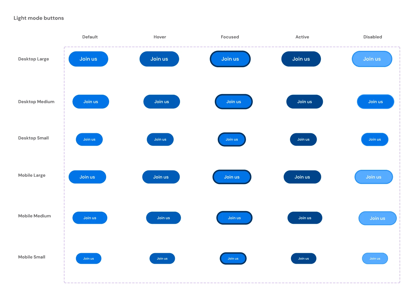
Light mode blue button variants
COMPONENTS
CMS (Content Management System) Table
The CMS table is one of the most complex components. It’s made up of smaller components, like the buttons shown earlier, navigation tabs, and the pagination.
This reflects the atomic design principles we followed for this design system.
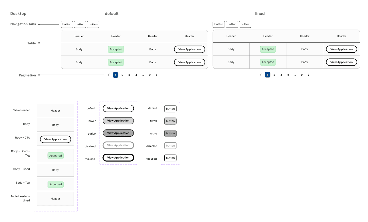
Light mode CMS table + components
DOCUMENTATION
For each component, we documented…
1. Component
Purpose & Use: A brief description of what the component does and when it should be used
Code: Insert code here
2. Anatomy:
Show the visual anatomy, labeling key parts such as… typography, colors, spacing
3. Variants:
Define when to use each variant and what sets them apart visually and functionally
4. States (if applicable)
Include all interaction states like Default, Hover, Active, Focus, and Disabled + visuals
5. Behavior and Interaction (if applicable)
Animation or Transitions: Specify any animations, such as fade-in effects, transitions
6. Best Practices (Do’s and Don’ts)
IMPACT
ACM after our design system
Design workflow
Token-driven decisions reduced design debates and ensured consistency
Design to dev handoff
Developers coded faster and better
“I coded everything way faster than before.”
Scalability & Future-proofing
Diamond Hacks 2026 was built 40–50% quicker
Team Growth
Faster onboarding for new designers and developers through clear documentation and shared component standards
Next Steps and Learnings
A big takeaway from this project is that design systems are living products — as ACM grows, I’ll continue refining components and ensuring the system stays scalable and consistent.
I also strengthened my systems thinking through this process. Instead of designing single screens, I learned how to design reusable frameworks and documentation that support designers and developers long-term.
Overall, this experience helped me understand what it takes to build scalable systems that teams can trust and grow with.